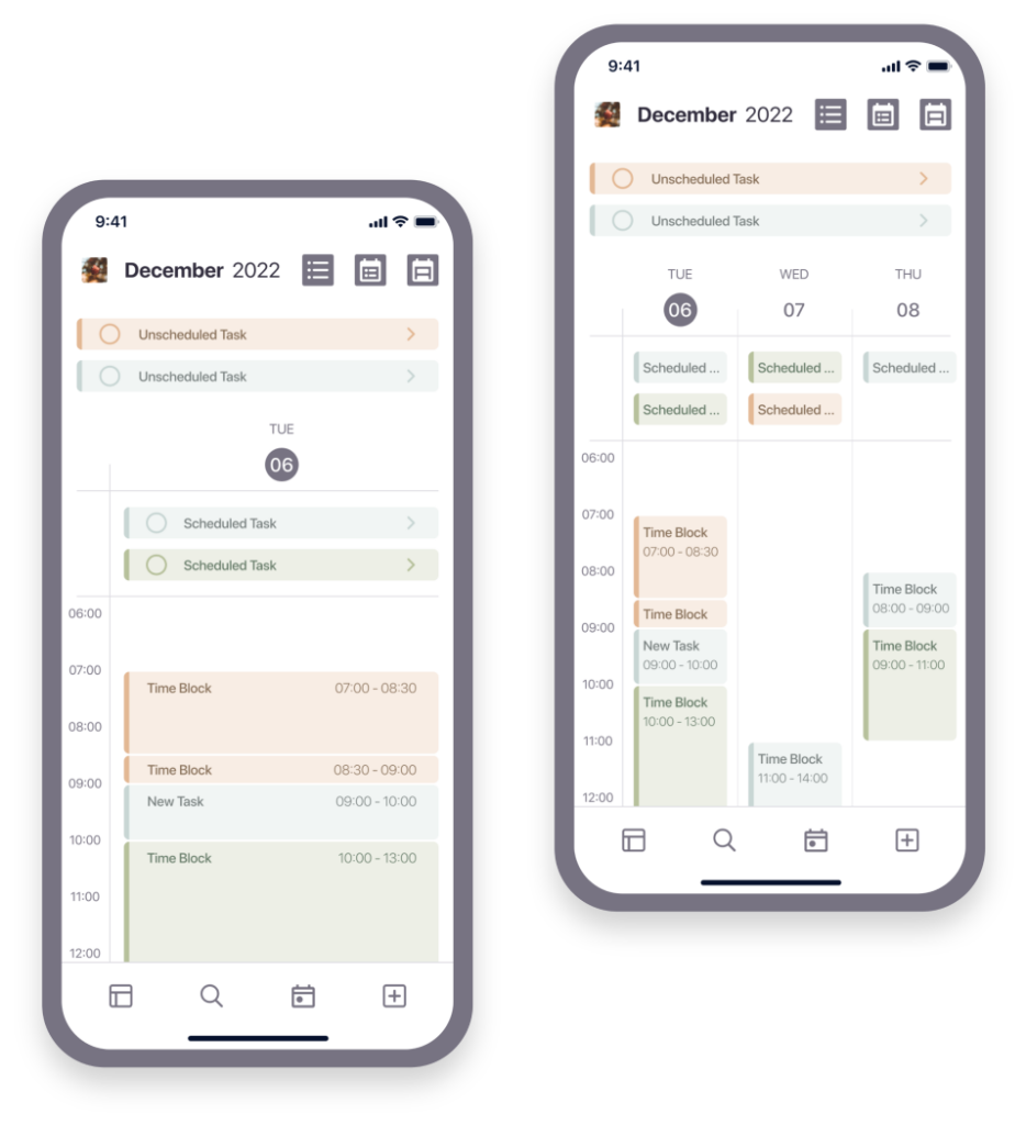
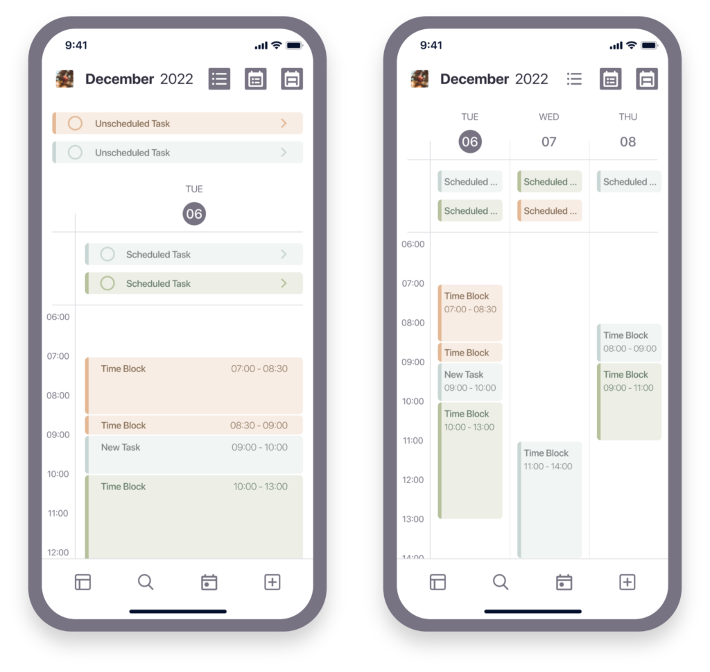
Concept of a task organisation app that combines the overview of a calendar with essential features of a task-list app.
Course: Udacity User Experience Nanodegree
Team: just me
Role: Research, UI/UX & Usability Testing
Tools: Miro, Figma, Lookback & Zeplin
Timeline: September – November 2022
Problem statement
I could never find a task organisation app that met all my needs, so I kept switching between different apps. To determine what opportunities and needs might exist for a new task organisation product, I wanted to learn about how other busy adults use digital tools to organise their tasks and what features they care about when using these tools.
Research
Interviews
To gather in-depth, qualitative data I conducted semi-structured interviews with busy, young adults who either have a full-time job or study at university and use digital products to manage their tasks.
Key insights
Analysing the data for key insights and synthesising the information into themes allowed me to recognise reoccurring needs and opportunities which then served as the foundation to ideate features.
The main insight was that all participants use a calendar app in combination with other task-list apps to organise their tasks.
Feature ideas
Calendar and task lists
Merge the overview of a calendar with different task lists.
Show and hide different tasks
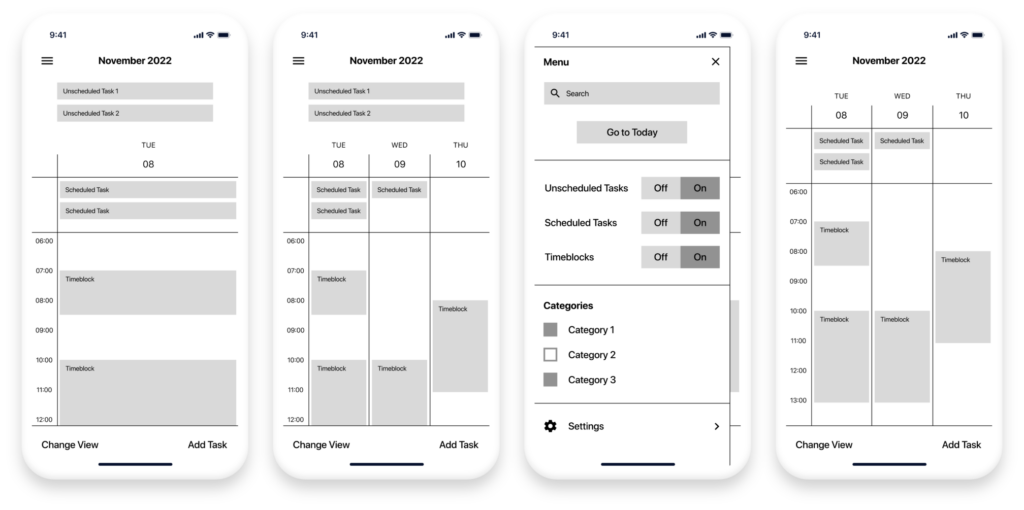
Enable and disable each of the different sections (calendar, scheduled tasks, and unscheduled tasks).
Customisable overview
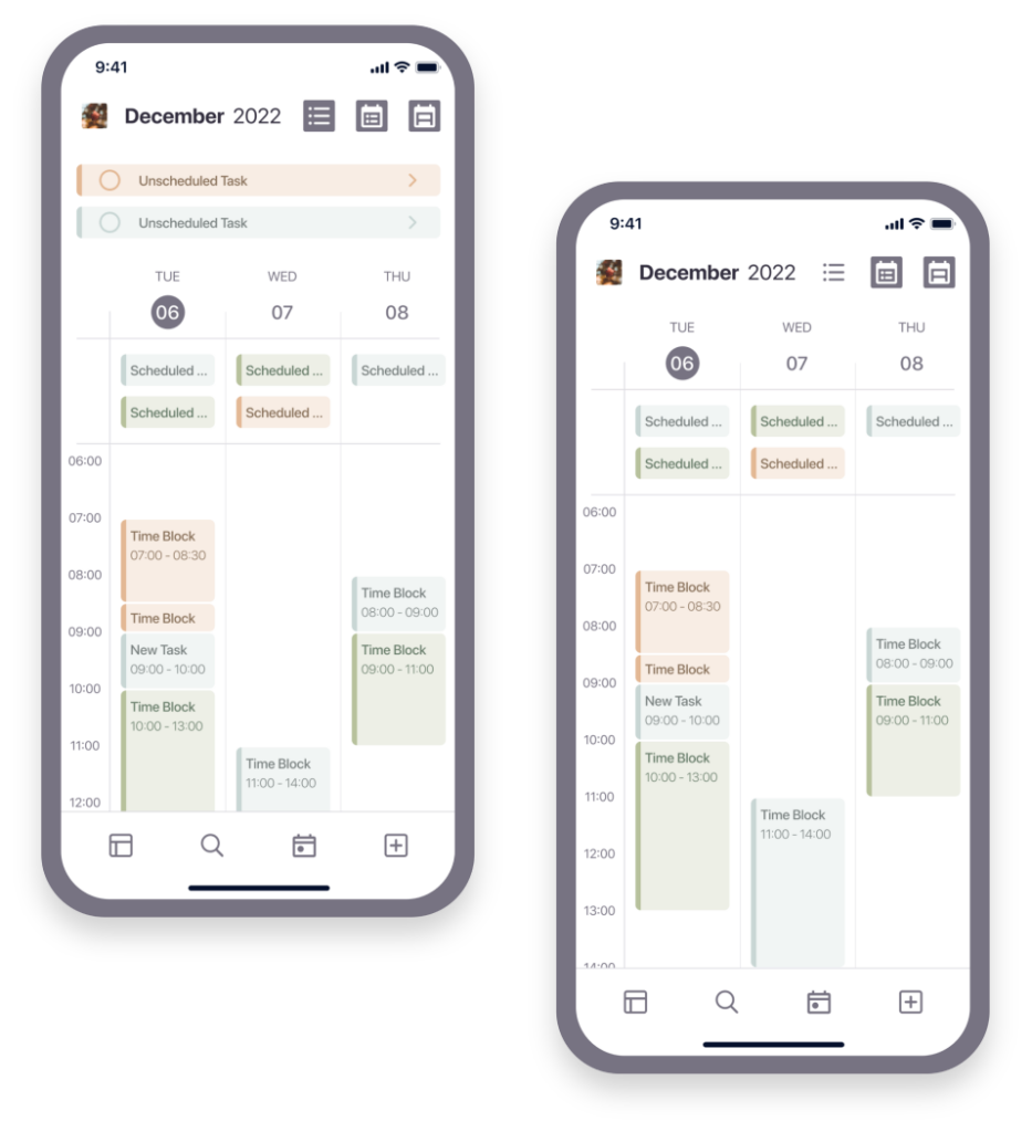
Enable 1-day, 3-day, weekly and monthly overviews.
Concept
Process
To come up with ideas for how to visualise some of the main features of the new product, I used techniques such as “Crazy 8’s”, “Detail Sketches” and “Layout Sketches”.
After exploring different options and possible solutions on paper I then brought my sketches into Figma by building low-fidelity wireframes.
Wireframes
Prototyping
User flow
After a first round of usability studies with a low-fidelity user flow I was able to gather initial findings and adjust the layout of the app accordingly.
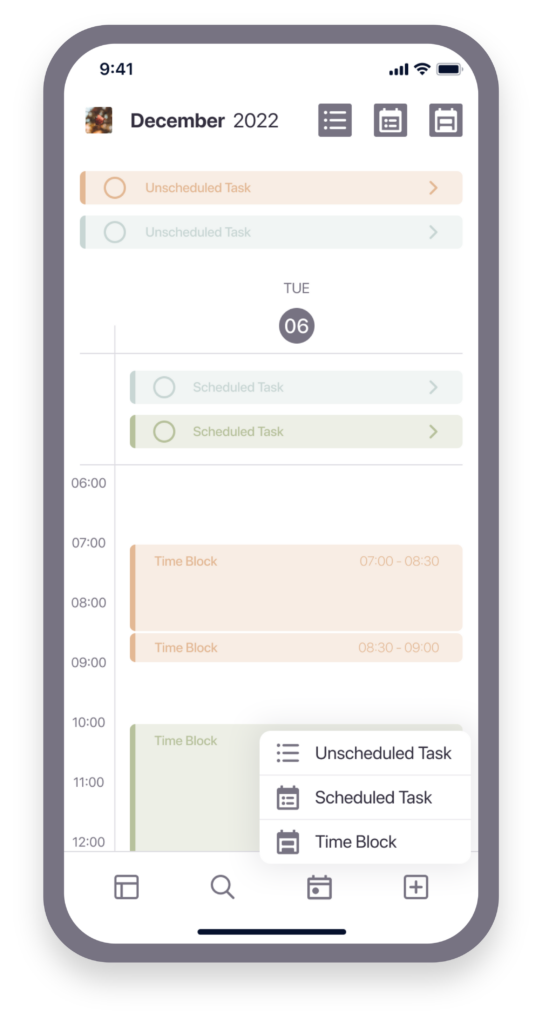
Next, I increased the fidelity of my mockups and created both a style guide and a pattern library sheet to keep the design well structured.
The user flow of the high-fidelity prototype includes these main tasks:
- Show Category 3
- Create a new task
- Hide the unscheduled task section
- Change the view to a 3-days view
Testing
Unmoderated self tests
After improving the design of the prototype regarding its accessibility, I set up a Lookback project to conduct unmoderated self tests with potential users.
Through these tests I was able to gain insights about the expectations different participants had towards certain features of the prototype and the layout.
Using Lookback and seeing screen recordings of the self tests helped me to understand exactly where in the process participants got stuck and how they interacted with the prototype in general.

Design Iteration
Key moments
Below are some of the key moments of the task organisation app after iterating the design based on the insights I got from the unmoderated self tests.
Creating new tasks
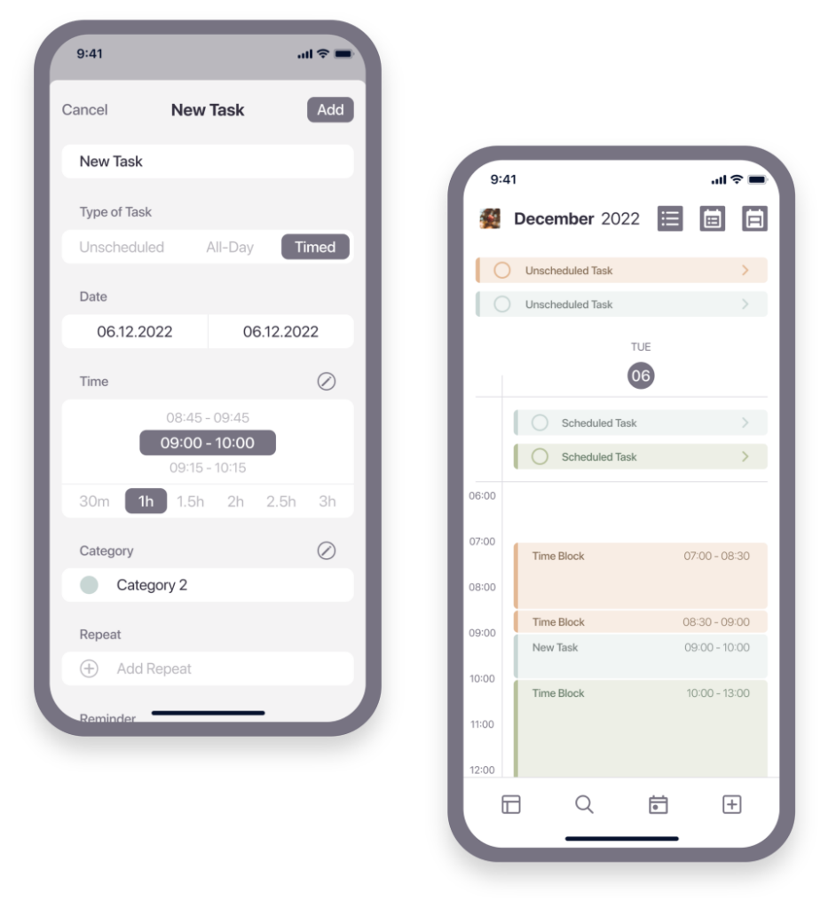
Users can create three different types of tasks:
- Unscheduled tasks are not bound to a specific time
- Scheduled tasks are planned for a specific day
- Time blocks are planned for a specific time
Depending on which type of task users choose in the slider of the task creation menu, the menu items change slightly and the created task appears in the corresponding section of the main overview screen.
Customising the overview
Another way to customise the overview of upcoming tasks is to show and hide the different types of tasks separately. This allows users to focus on what is important to them at the moment and avoid information overload.
Visual system
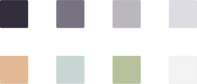
Colours
Typography

Bold; used for titles
Medium; used for buttons, captions, date & task titles
Regular; used for menu items, timeline & weekdays
Light; used for timeframes
Outcome
Deliverables
Designed and prototyped screens illustrating the concept of a mobile task organisation app.
Values
The concept provides value to busy, young adults who want to manage all of their tasks in one place.
Less switching between apps
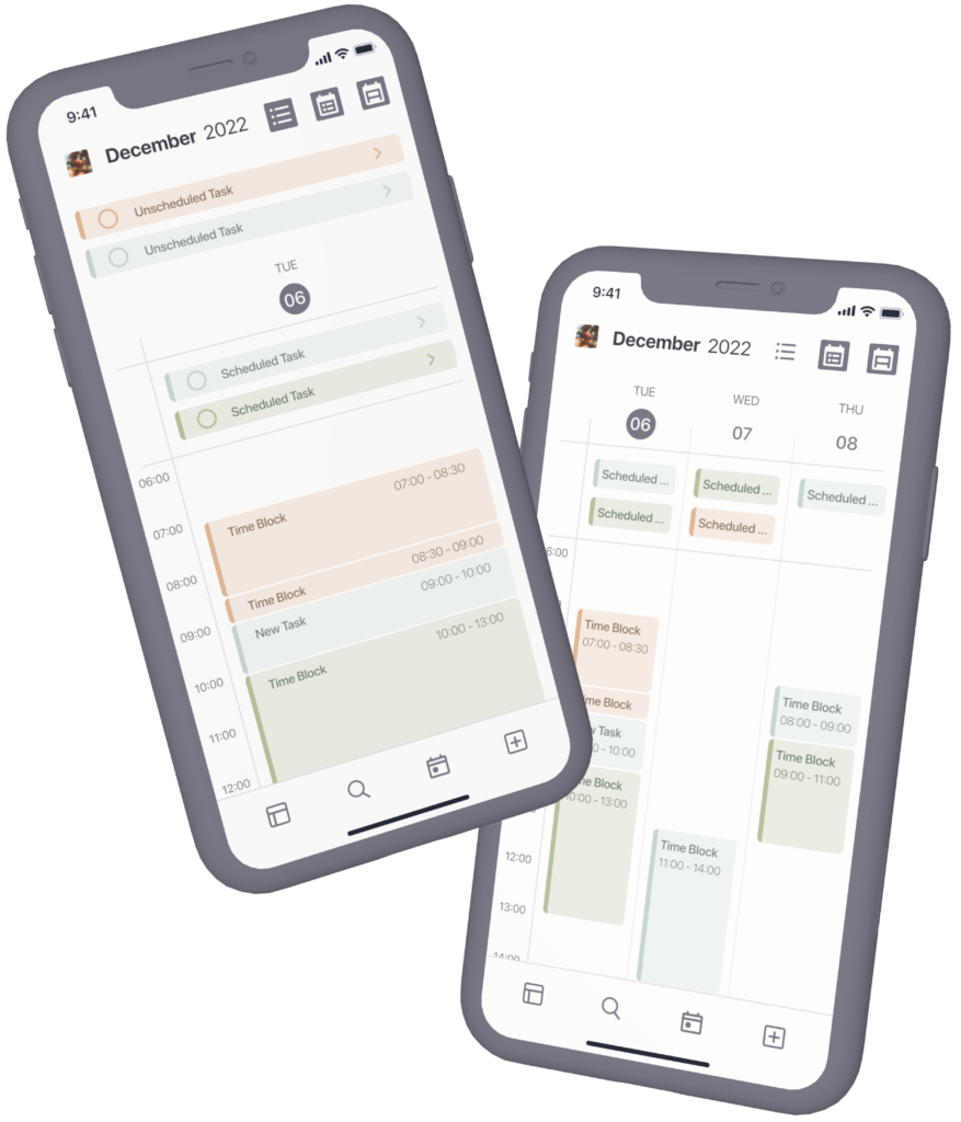
The concept merges the overview of a calendar with essential features of task-list apps so users can track all of their different tasks in one place.
Better overview
Since users can manage all their different tasks in one place, they have a better overview of all upcoming tasks.
Future Roadmap
Future research
Once a product like this could be built in a MVP form, there are several things that should be tested.
A few are included below:
Does using this app improve task organisation and user productivity?
To what extent does this app meet the needs of the users?
What are the most commonly used features of this app?
Future use cases
With continued research and iterations, the concept for the task organisation app could be further elaborated and refined. A few ideas for future work are:
Drag and drop
How useful might it be to be able to drag finished unscheduled tasks into the calendar section to track when and how long you worked on them?
Simplify task creation
How might the task creation process be further simplified? How can users be enabled to quickly create a list of tasks?

Contact
info@elenabraeutigam.com
